Working with a global quick-service restaurant brand allowed me to apply strategic graphic design at scale. At 500 Degrees Studio, I worked with Popeyes Louisiana Kitchen to refresh the brand’s physical and digital asset ecosystem, including in-store signage, out-of-home placements, packaging solutions, and social media visual systems. The core challenge was to maintain Popeyes’ distinctive bold personality while improving brand clarity and operational consistency across thousands of locations worldwide.
My role spanned ideation through to execution. I conducted competitive research, developed conceptual treatments, created reusable templates for signage and packaging, and coordinated with print and production partners to ensure quality and cost efficiency.
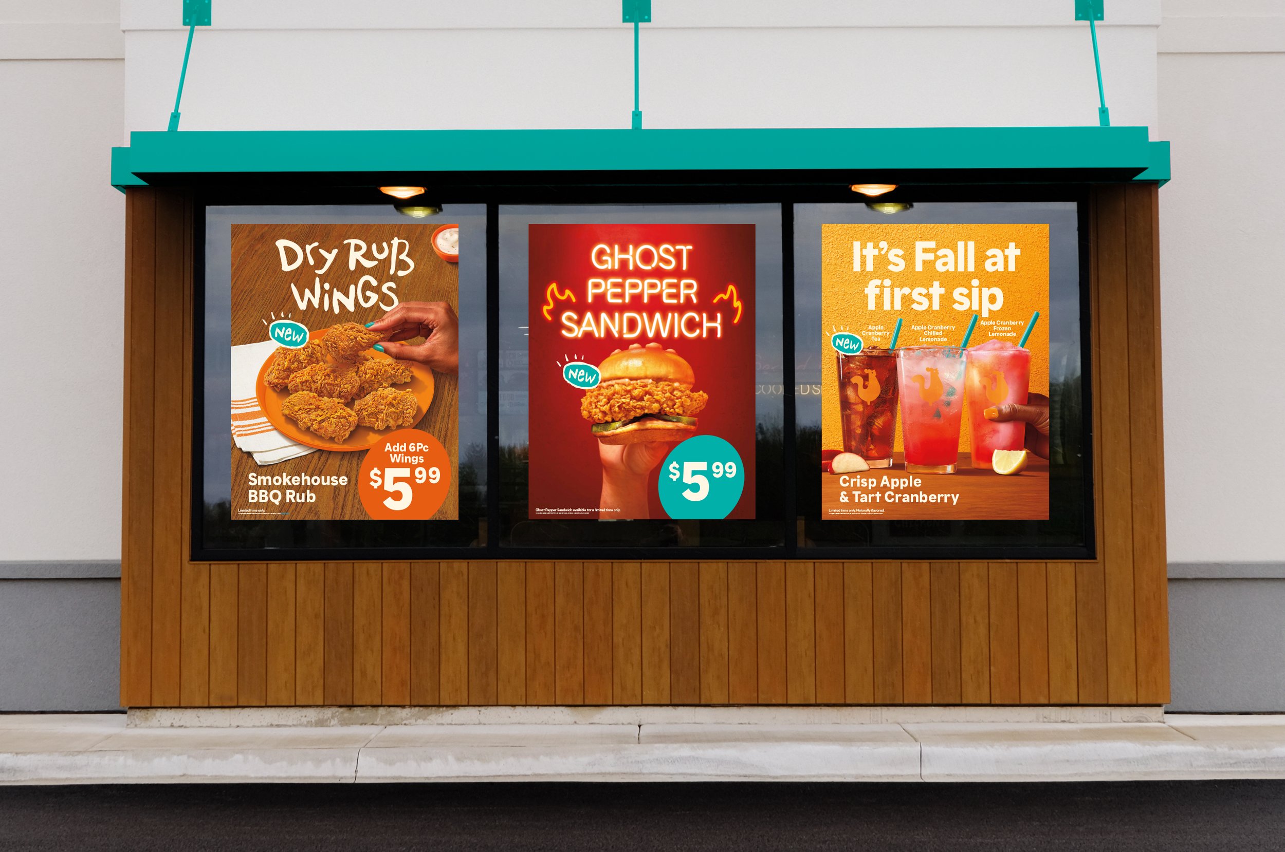
As an example, in the rollout for the Ghost Pepper Sandwich, conceptual visuals were collected from field research to find a strong north star identity. Next, a net new typographic lockup was paired with the fiery orange accents and strong photography to push the brand’s look and feel for a premium product while staying on-brand. This resulted in strong visuals thoughout touchpoints.
Throughout all of these projects, coherent visuals exist across every touchpoint, from window clings and yard signs to packaging. This consistency enabled faster rollouts for new product campaigns, strengthened brand recall in high-traffic environments, and improved legibility and impact on-premise. The work here reinforced my belief that strategic design systems, when thoughtfully applied, become brand multipliers rather than isolated pieces.
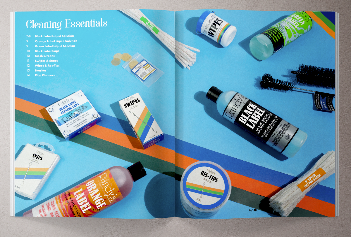
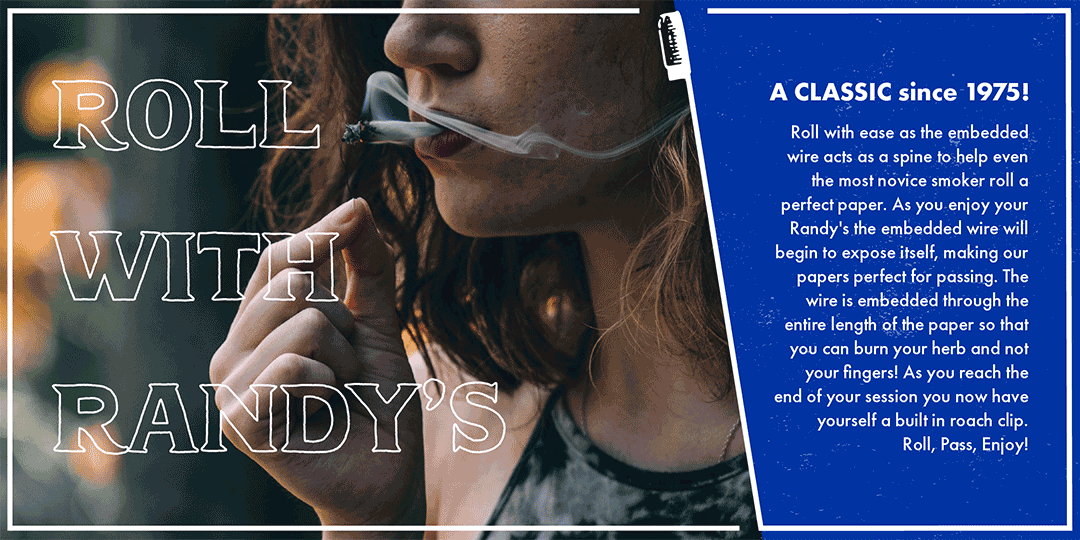
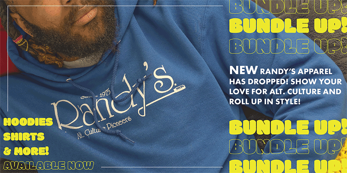
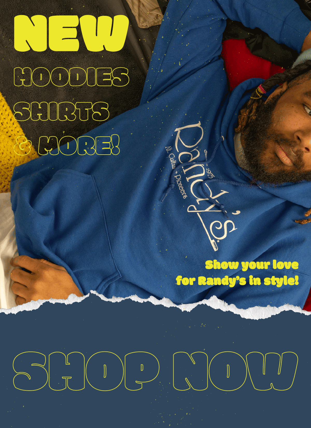
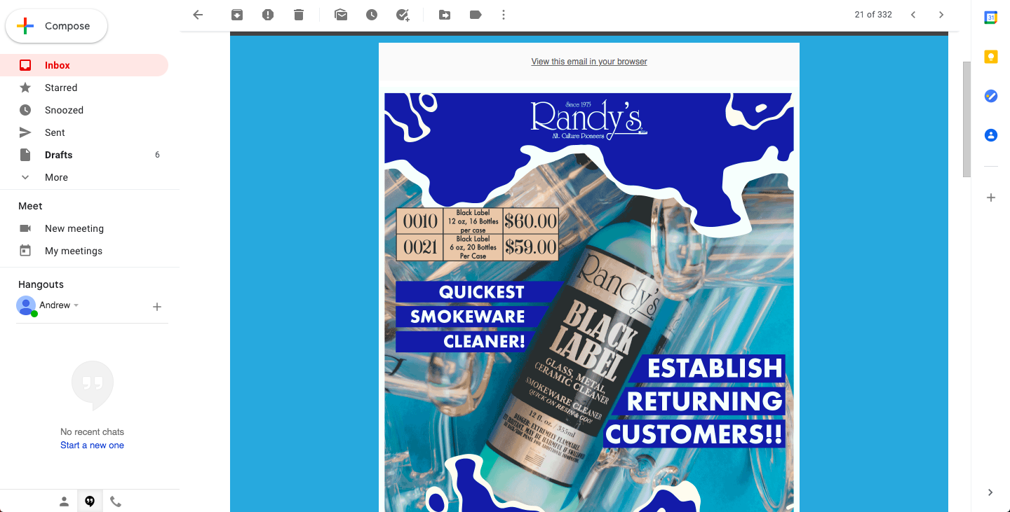
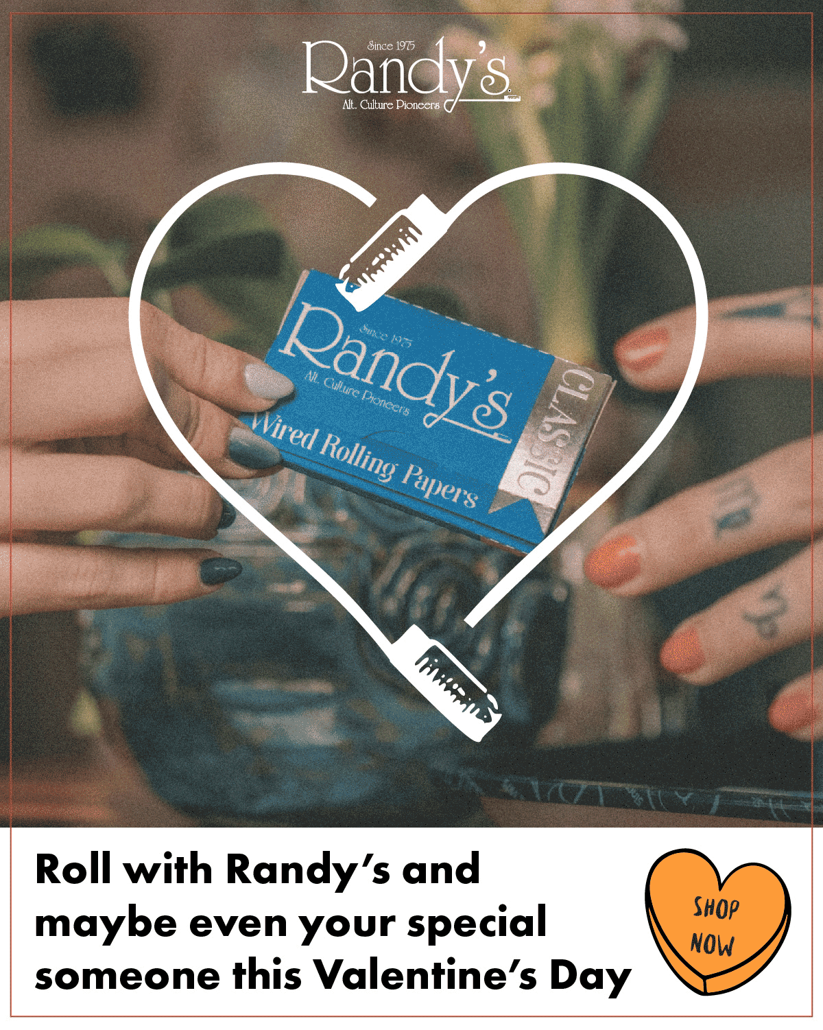
Since 1975, Randy’s has been a staple in the smokeware industry. Famous for their first big hit (get it?), their patented wired rolling papers, Randy’s has since been keeping pace with competitors by expanding their catalog of smokeware products to vaporizers, glassware, and more.
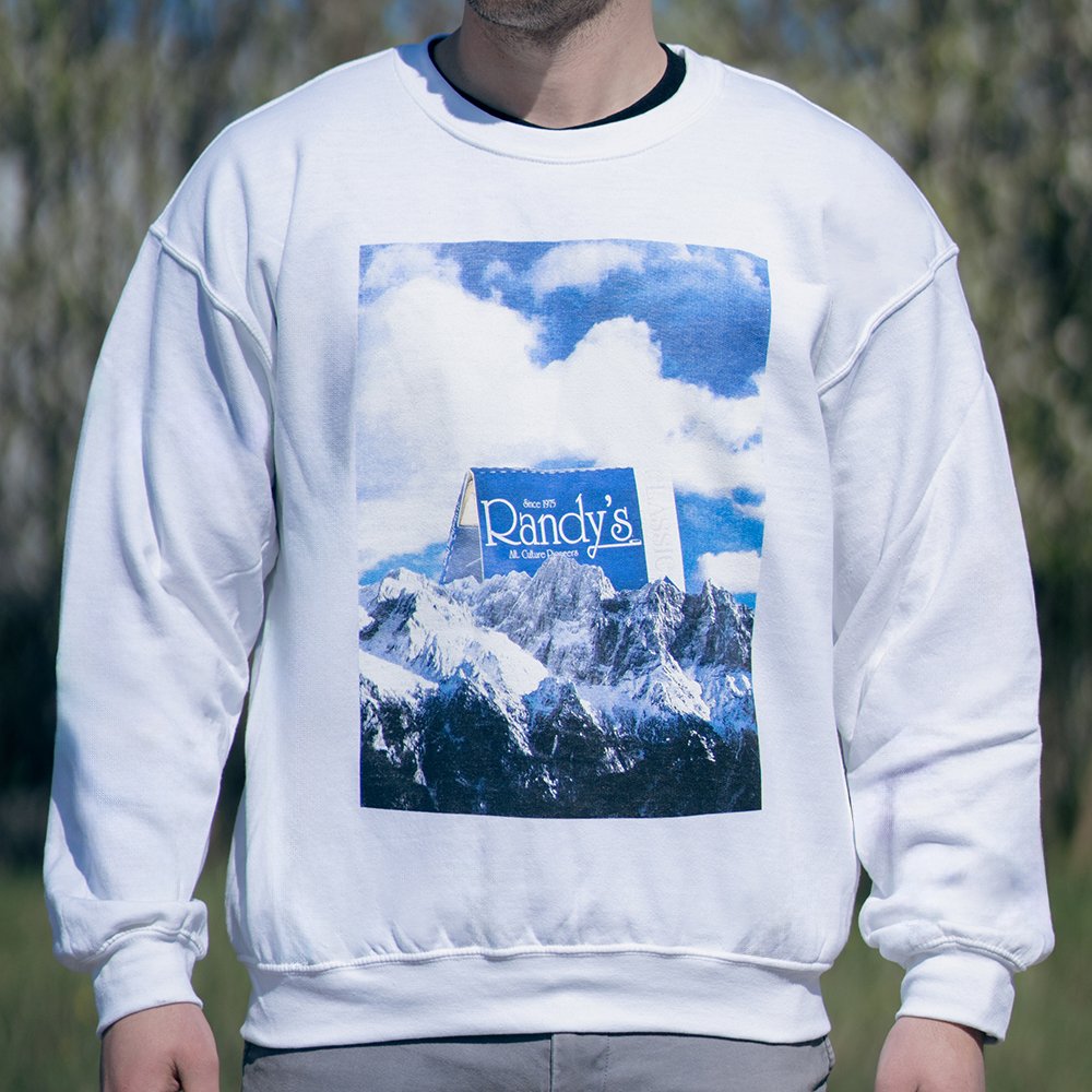
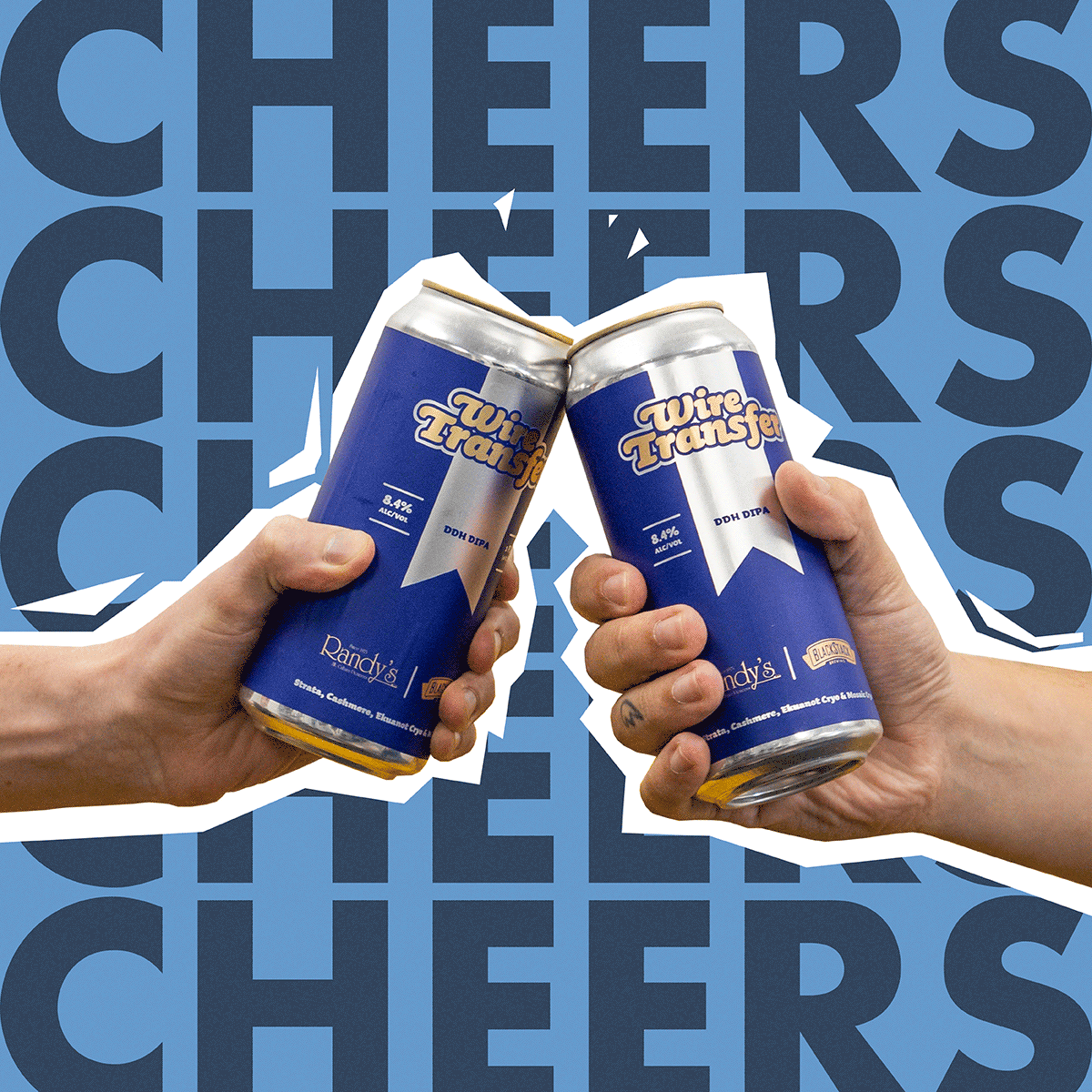
When I came aboard Randy’s, their visual identity was in need of some good old TLC. Much of their brand, particularly in their packaging, was very out-dated and being kicked out of the shelf spotlight by their more modern competitors. By integrating their 1970’s San Franciscan roots with a more modern and exciting direction, Randy’s identity is more engaging than ever. With funky, colorful designs, Randy’s can now proudly attach themselves to their hip, vintage heritage while keeping pace with the fierce market of smoke/vape products.
Photography by Marcus McAninch and marketing management from Michael Wiedle.
CAS (Chemical Abstracts Service) is a Columbus-based science research company with global offices in 45+ countries. Founded in 1907 as a volunteer effort to organize published chemistry research, CAS officially became a self-supporting division of the American Chemical Society in 1956.
For CAS, I helped to conceptualize and create many visual assets to support their presence and outreach through digital markets and social. From static banner ads to eye-catching short animations, I designed dozens of assets working with copywriters, creative direction from both internal sources as well as beneficial communication from the client. Following and adhering to CAS’s brand was crucial to maintain their identity and voice.
Fabric of Innovation :30 video created with assistance from Spillt agency located in Denver, CO.
WonderBus is an annual music and arts festival in Columbus, Ohio with an emphasis on mental health awareness and inclusivity.
Focusing on fun, playful elements to emphasize the friendly and open energy of the event, I helped to ideate and create assets to pitch to the parent company of the festival. While retaining an organic, hand-drawn visual language, I ensured elements could be widely applicable regardless of medium or size.
The Air Force provides K-12 STEM outreach opportunities across more than 40 locations. As part of a branding overall for the Air Force’s K-12 STEM program, I worked with a team of other designers, copywriters, and creative directors to ideate a visual elevation for future endeavors.
Pictured are my logo and branding concepts for this program. From a visual direction, I aimed to make nods towards the Air/Space Force as a US military entity, academic aspirations ranging from Kindergarten to grade 12, and how this logo needs to work on micro and macro levels, ranging from digital to print to apparel and beyond.
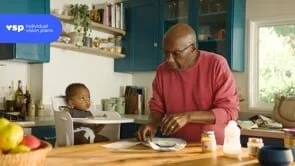
With a vision of providing access to high-quality, cost-effective eye care to the world, a group of optometrists founded VSP in 1955. More than 60 years later, that vision has evolved into providing world-class products and services to eye care professionals, employers, and more than 80 million members worldwide.
In this campaign named Bridge to Bridging, I worked with a copywriter, art director, and the client themselves to create a succinct and poignant campaign to bring attention to the important, simple practice of proactively caring for your eyes. Combining a :15 commercial with digital banner assets, Bridge to Bridging effectively caught the attention of many eyes, indeed.
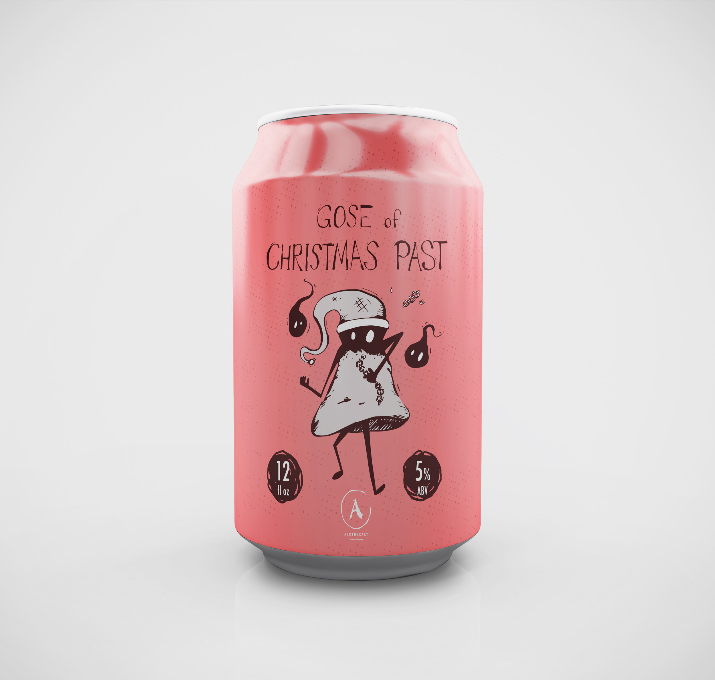
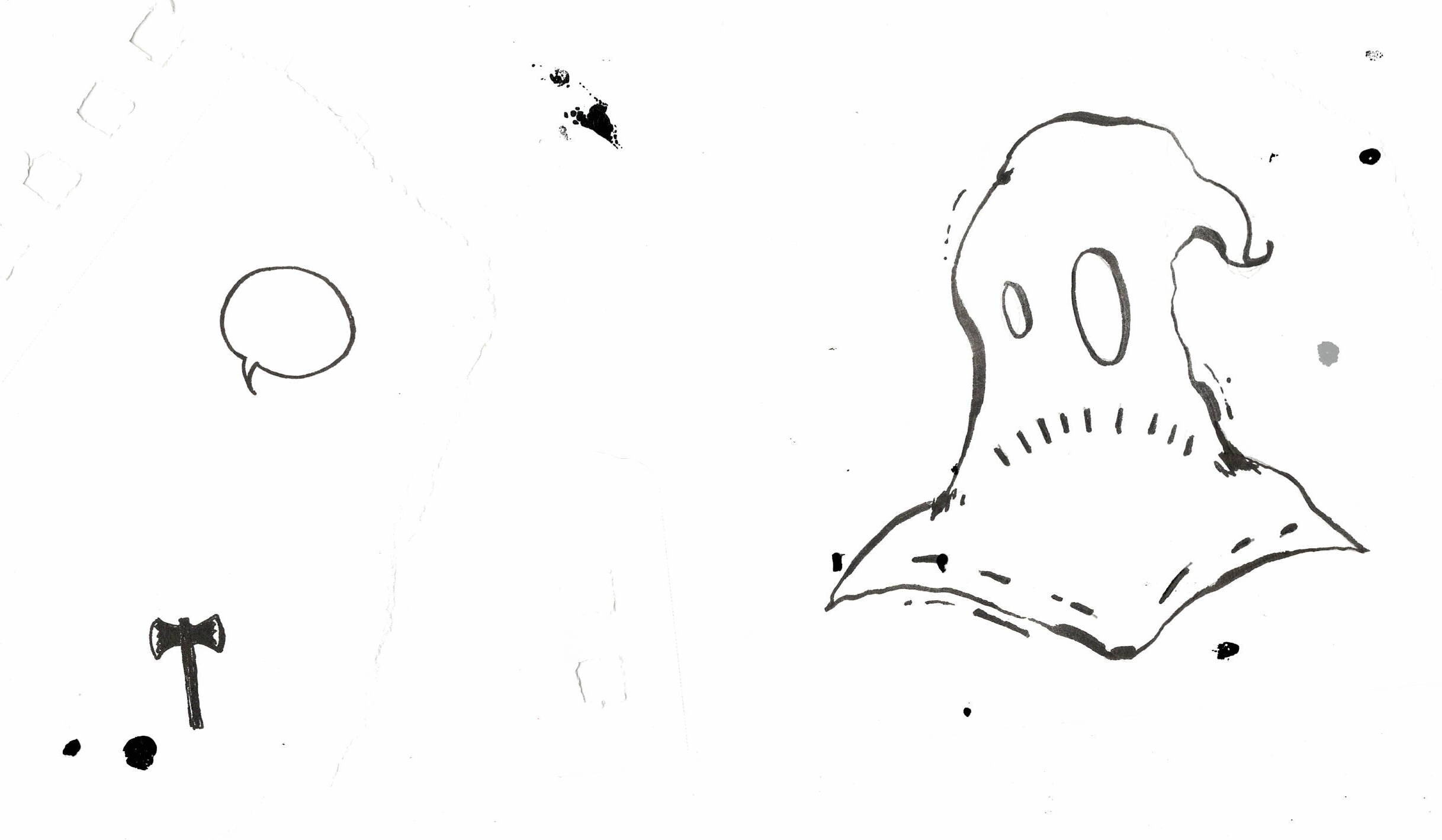
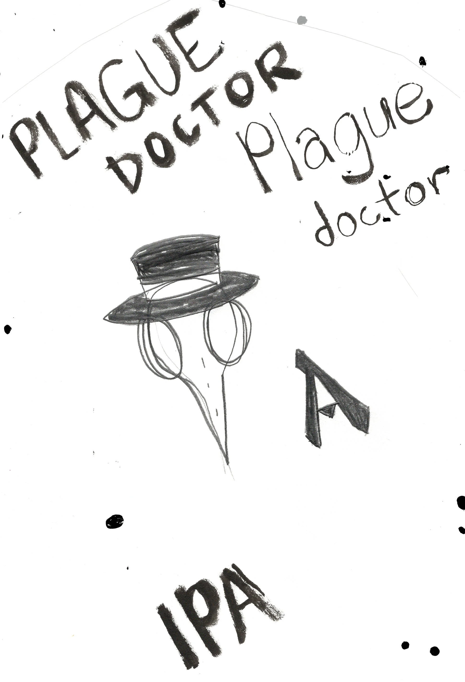
An ongoing branding project for “my” micro-brewing endeavors. A perfect marriage of my love of design, illustration, and thoughtfully crafted brews.
The art direction of the brand has an emphasis on a graphic, light-hearted “comic-y” feel to separate itself from the more snobby, self-important “artisan” players in the craft beer scene. A cast of characters of sorts showcases both the beer labeling and opens up opportunities for usage on physical collateral, social media, etc.
Good beer should be for the people and all beer deserves love and personality to bolster what it stands for. The brave folks who brew pour their soul into what they do, so they deserve designers who are willing to do the same.
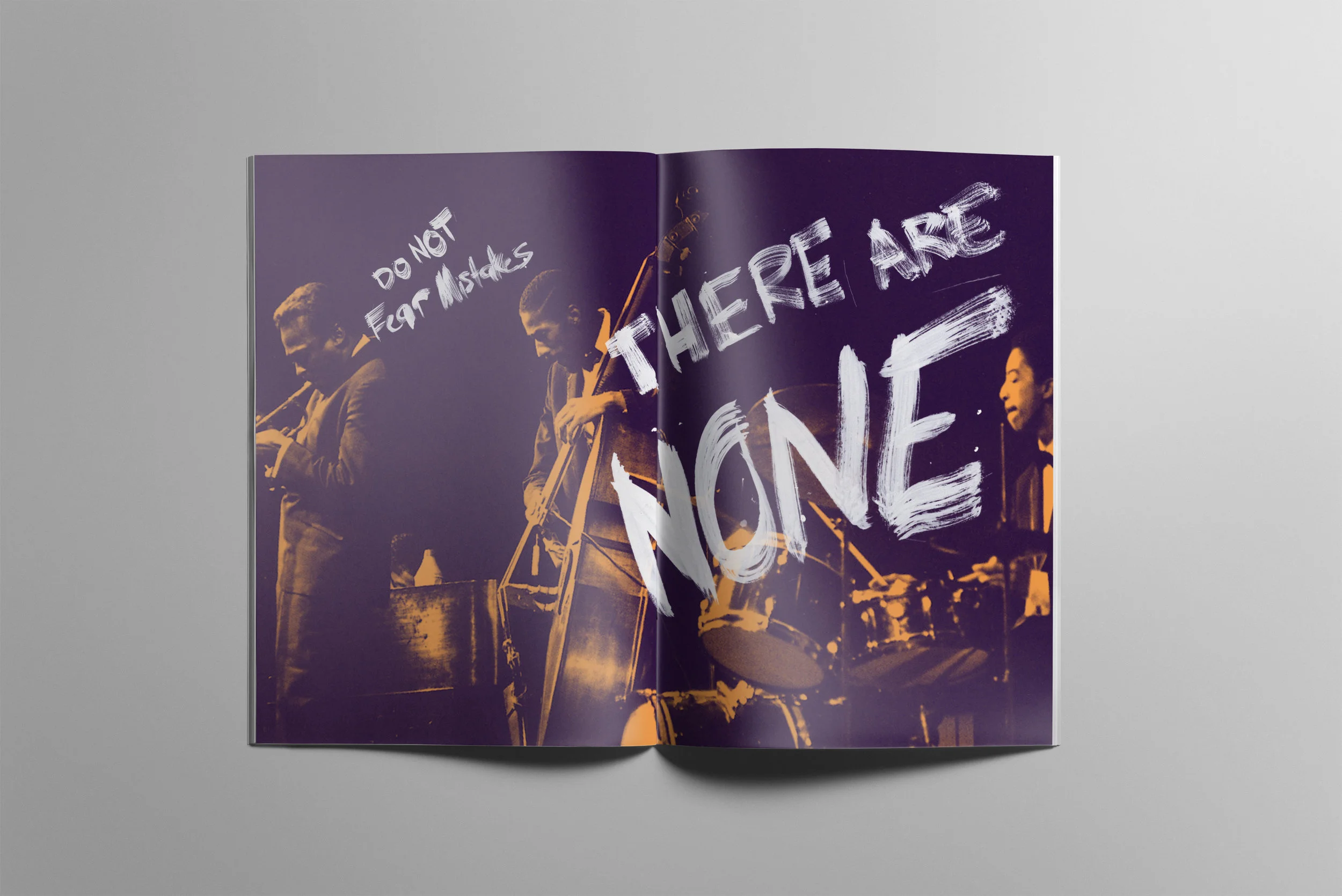
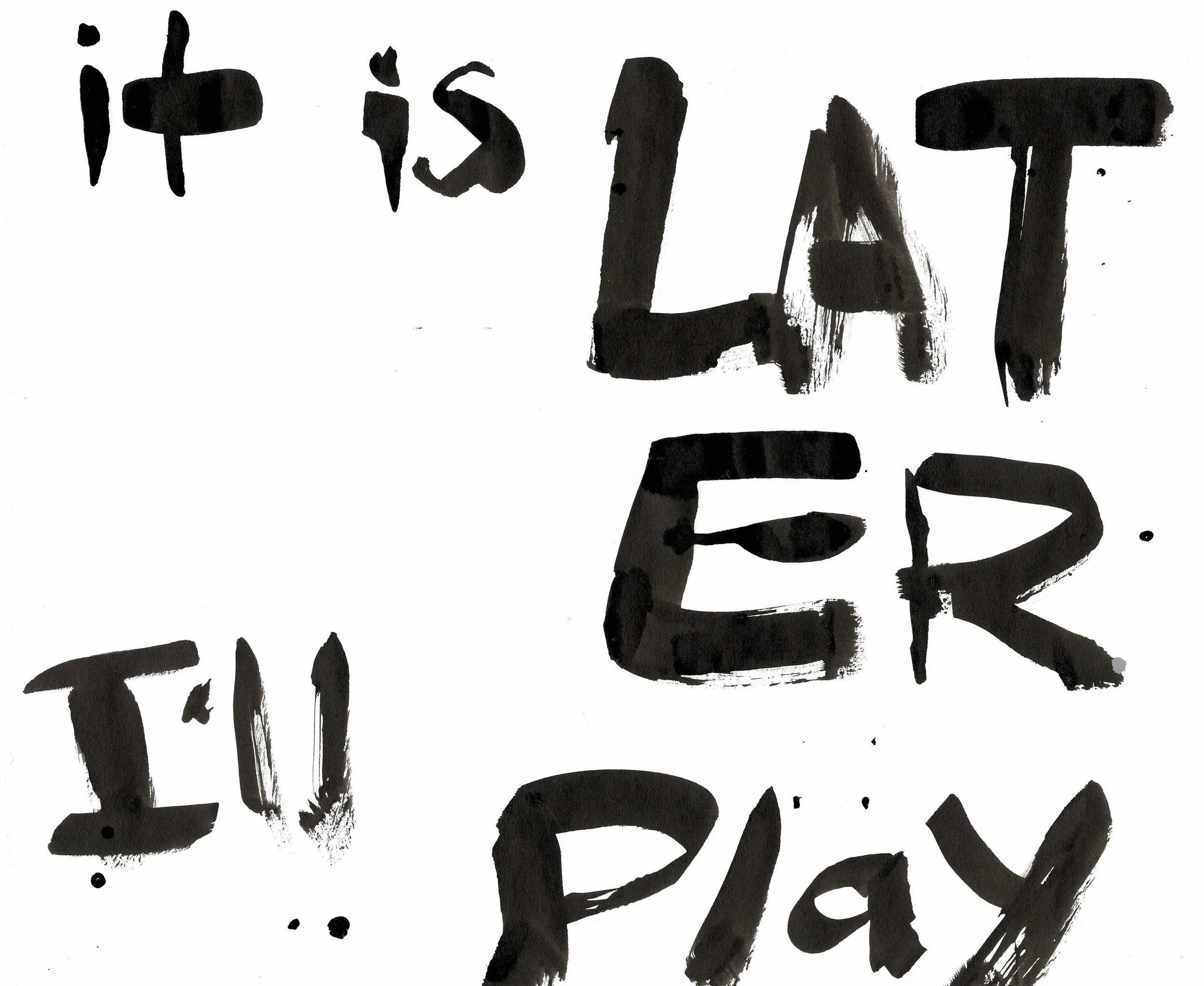
This objective here was to create a comprehensive book based on a person or movement in history. Jazz legend Miles Davis was my subject of choice, of course, and I delved deep into researching how to present one of the most prolific artists of the 20th century. Incorporating iconoclastic, visually-striking style and type, I am proud to have created a brief history of one Jazz’s true pioneers.
The big, expressive type moments were created by painting the lettering traditionally with a brush and india ink on bristol board, then scanned and cleaned digitally. These allow for some exciting ‘pause’ moments within the book. The brush technique is similarly used as a style element on the more traditional informational spreads.
A lot can be learned and appreciated from Davis’s career and ideologies, even from a design perspective. It’s his tremendous tenacity and dedication to his craft that molded him into arguably the greatest musician in the 20th century.
“Sometimes you have to play a long time to be able to play like yourself.” -Miles Davis
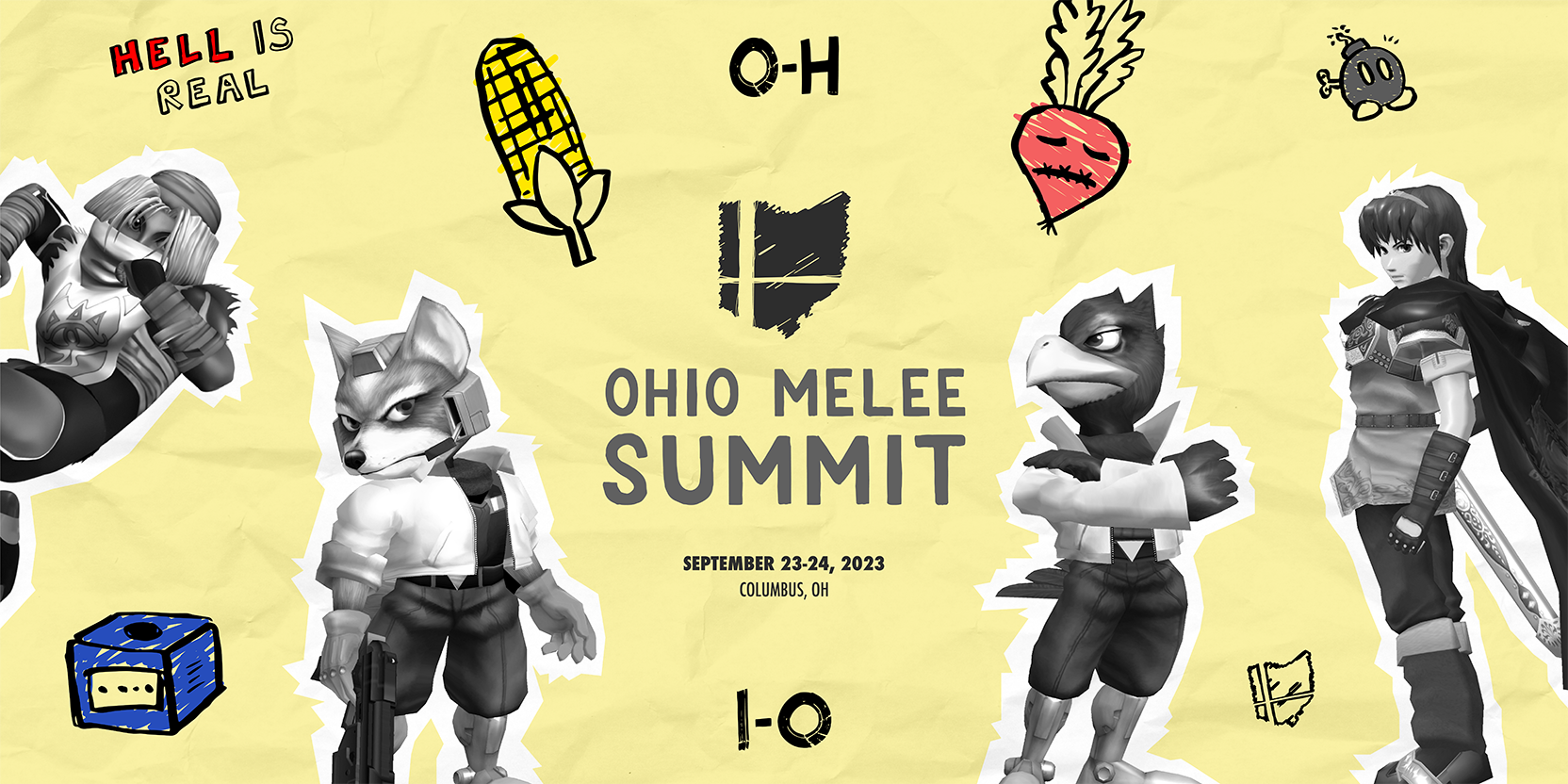
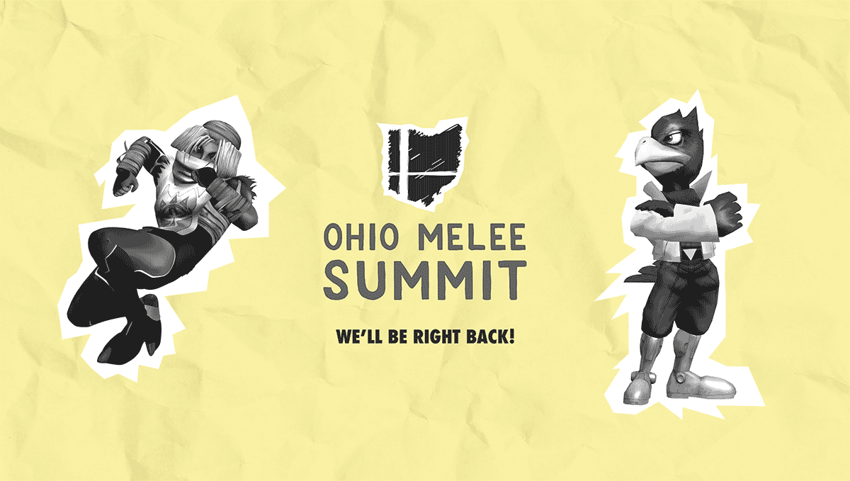
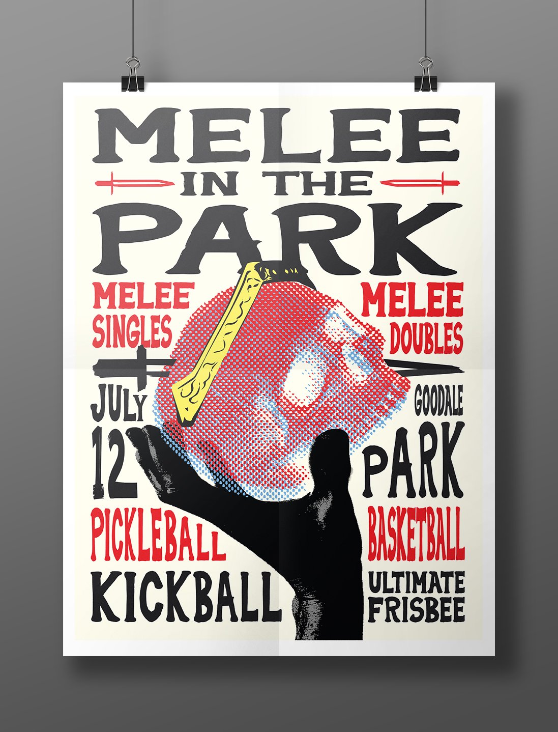
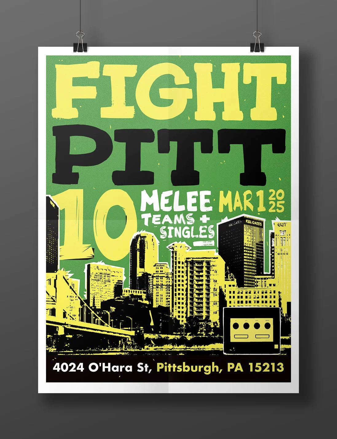
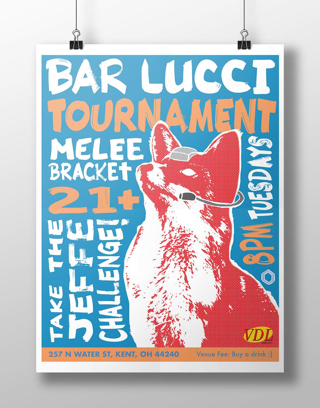
Over the years I have had the opportunity to contribute to the organization and execution of many grassroots eSports tournaments and events. Creating the graphic suite of visuals for these events has lead to higher participation and awareness from newcomers and returning competitors.
The unique grassroots style and informality has been an exciting aspect to navigate in tandem with other organizers.
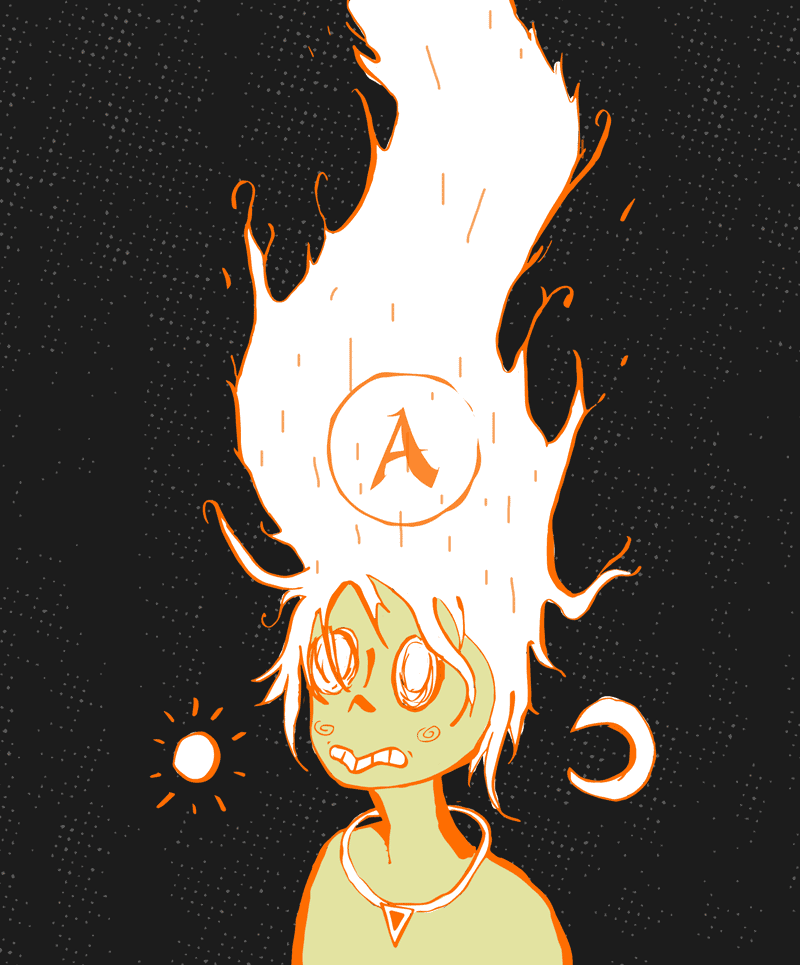
Odds and ends.
Photography examples from my freelance and editorial career.